My Approach to Design — Making Design Your Sales Wingman

Henrik Harju
Chief Conversion Officer
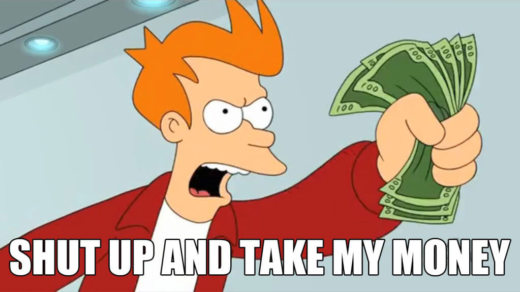
Your website’s design doesn’t have to be just a pretty face; it can be a tour guide that leads folks from “just looking” to “shut up and take my money.”
Clearly highlights what’s in it for them and uses visual cues to make the path to purchase as easy as possible.
That’s really what design on a website is, or atleast, should be.
Design should help guide users from point A to point B on their buying journey.
Little Things Can Have a Big Impact
Design is not about choosing a blue or a green color for a button.
But the fact that a button clearly pops out enough that users know where to click in order to make a purchase goes a long way.
You’d be surprised how often I land on a website.
Already in buying mode ready to spend my mulah, but they just make it too damn hard for my smooth brain…
So I end up giving up and go see if a competitor is making it easier.
People dig simplicity.
I believe that a clean, modern look with benefit driven content and visuals that aid in conveying benefits is the ultimate recipe for getting folks to stick around and take action.
Don’t try to reinvent the wheel
When crafting online user experiences, it’s crucial to remember that people have developed habits and expectations around common interactions, especially on the web.
A prime example of this is website navigation.
When users visit a website, they come with a set of ingrained expectations based on their prior experiences.
They anticipate finding the navigation menu in certain standard locations—like horizontally across the top of the page or vertically down the left side.
Attempting to reinvent these conventions, to be different for the sake of being different, backfires 99 times out of a hundred.
So it’s better to not try to reinvent the wheel as it leaves visitors confused and frustrated.
Frustrating visitors should not be the goal of a website.
Closing thoughts
Keep it simple, clear, and consistent.
Remember, good design guides users smoothly, using familiar paths with a touch of visual hints and clear communication.
Boom, there you have it— my no-fluff thoughts on how to use design on a website to make it your sales wingman.